DUTCH MUNICIPALITIES -
EQUALITY IN CHATBOT USAGE
Scroll is available :)
Accessibility is one of the most important aspects of how we keep every civilian involved in our activities. Ensuring that everyone, regardless of
disabilities, stays involved in society is something we as designers (should) think about every day.
Together with the municipalities of Rotterdam, Utrecht and Dordrecht, we joined forces to make the new municipal chatbot accessible to citizens with visual impairments.
Accessibility is one of the most important aspects of how we keep every civilian involved in our activities. Ensuring that everyone, regardless of disabilities, stays involved in society is something we as designers (should) think about every day.
Together with the municipalities of Rotterdam, Utrecht and Dordrecht, we joined forces to make the new municipal chatbot accessible to citizens with visual impairments.
Client
Municipality of Rotterdam, Utrecht & Dordrecht
Role
UX/UI & Visual Designer
Team
Year
2023
Client
Municipality of Rotterdam, Utrecht & Dordrecht
Role
UX/UI & Visual Designer
Team
Year
2023


Introduction
In 2023, all municipal institutions in the Netherlands were in the process of introducing a virtual assistant (GEM) that would help citizens complete civic matters and questions. This would, of course, allow citizens to ask questions outside office hours without the need for human assistance.
To be able to help all citizens in the Netherlands in the most optimal way possible and respect inclusiveness, it is important that the municipal virtual assistant is accessible to everyone: including people with (temporary) disabilities. This is where we came in.
The Problem
From the briefing, we were told that, to date, GEM can complete 14% of questions without the intervention of a human assistant. The participating municipalities were eager to see this percentage increase, as it is a legal requirement to have municipal websites accessible to all citizens in the Netherlands.
In the desired situation, we saw a perfect cooperation between man and machine. Citizens with disabilities would be able to navigate independently to their municipality's website without any problems and be successfully assisted by GEM.
Prior to the project, we briefly researched the different disabilities in the Netherlands. As we were going to work with a digital product on the website of different municipalities, we chose to focus on people with visual impairment at the beginning of the project.

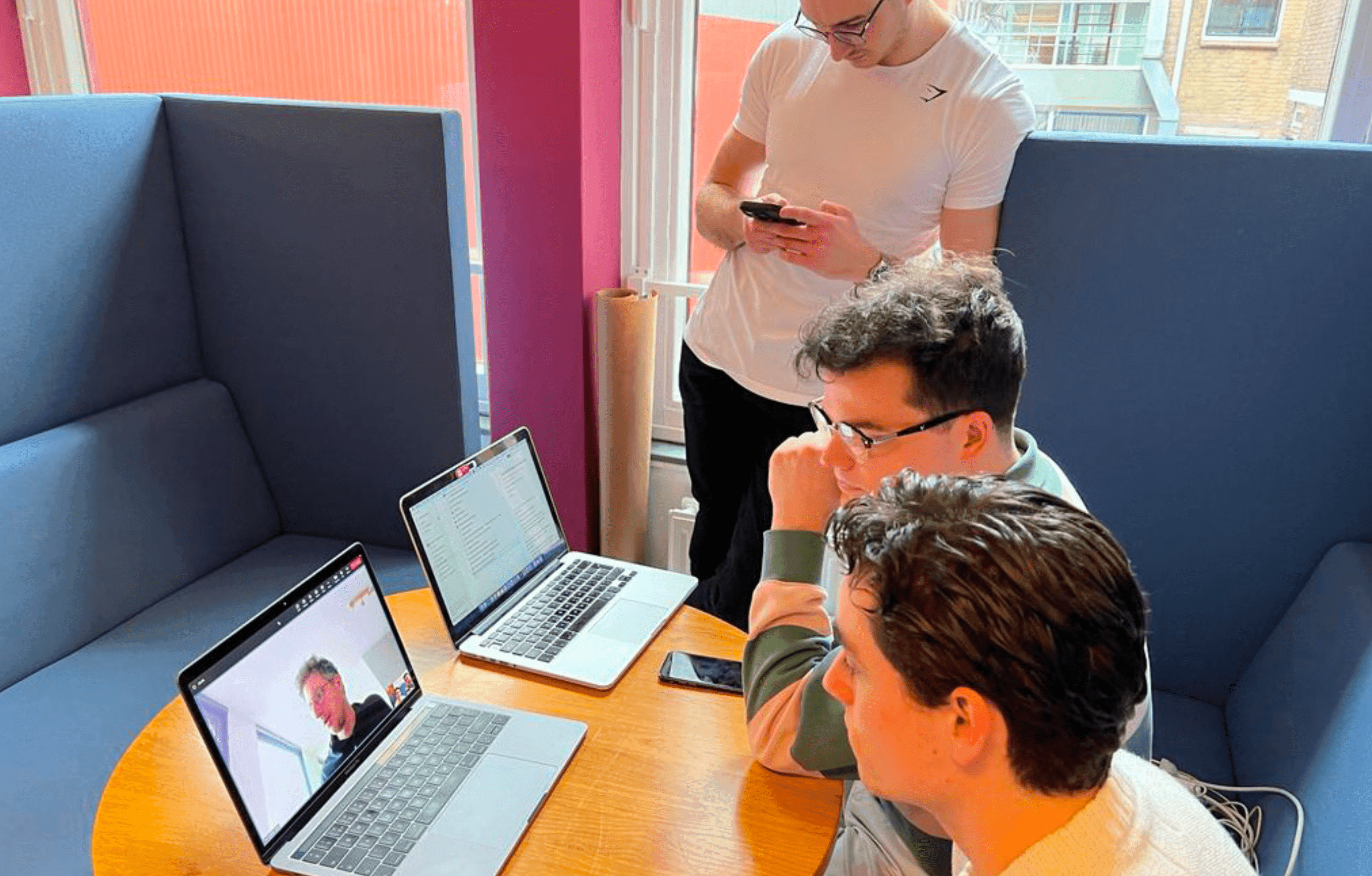


The Users
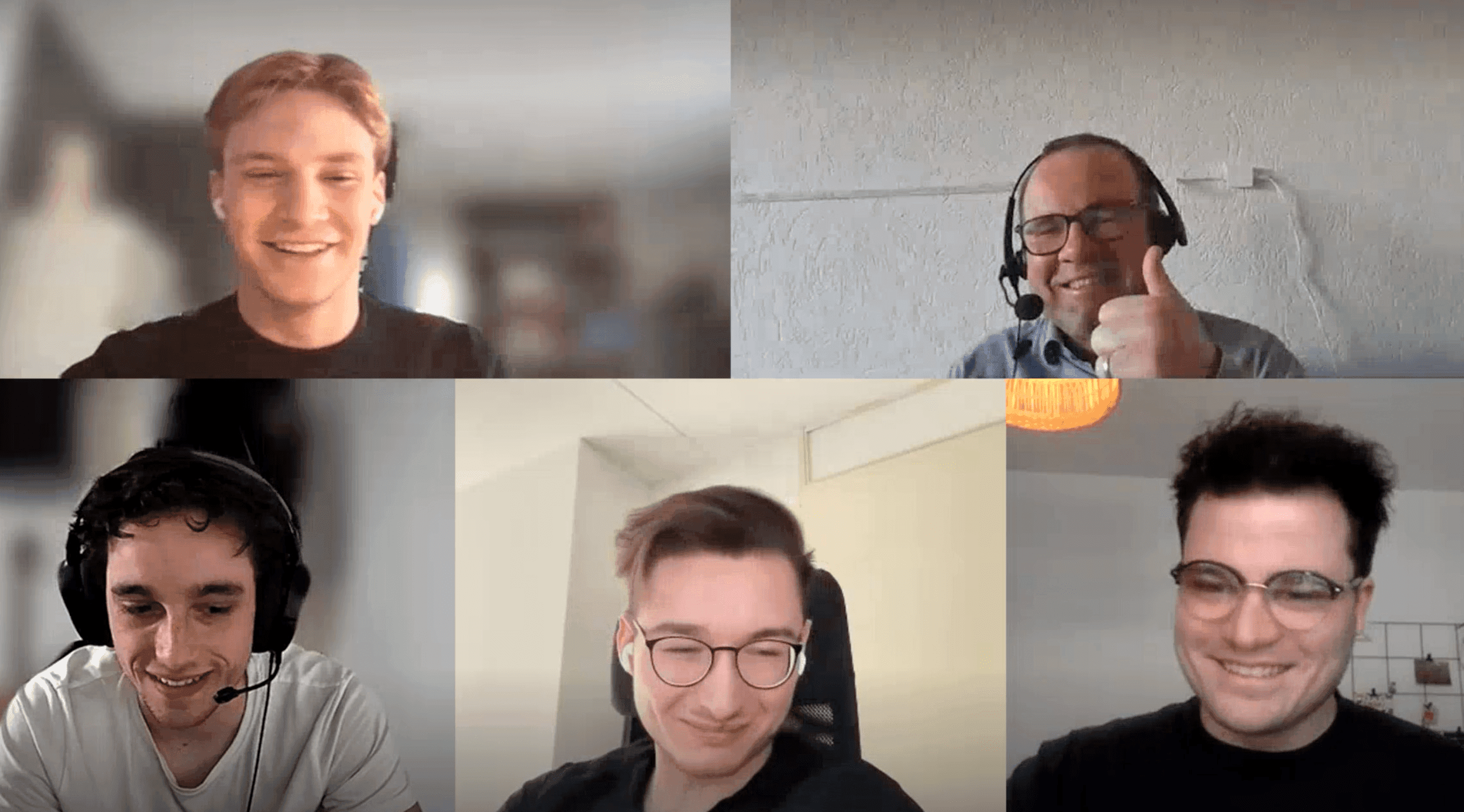
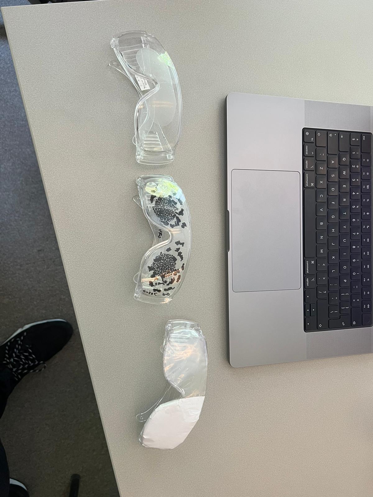
To make sure we really got to know our target group of visually impaired people, we first conducted some research independently. Using sources sourced from the internet, we were able to create an empathy map with some assumptions that we would be able to confirm or disprove later in the project when we engage in conversation with our target group.
These conversations quickly followed and through three interviews with people from our target group we were able to create the insight cards with the most important insights listed:
• A screen reader and the accessibility features of websites (IF they offer the features) are widely used during a digital experience.
• Buttons and image are one of the biggest pain points if not properly labelled.
• Incorrect colour contrasts (not following WCAG guidelines) can unnecessarily drain energy or even cause physical pain to the target audience. "Form follows function": also in this case.
• There are various forms of low vision that require us to take into account the positioning, size and contrast of our functionalities.
• Text to speech and vice versa is considered pleasant and functional.
• People with visual impairment do not (yet) trust chatbots enough so they should always keep the freedom to be able to contact a human employee.
We eventually presented our work (consisting of an Empathy Map, COCD-Box, Customer Journey and User Persona) and research to the client.
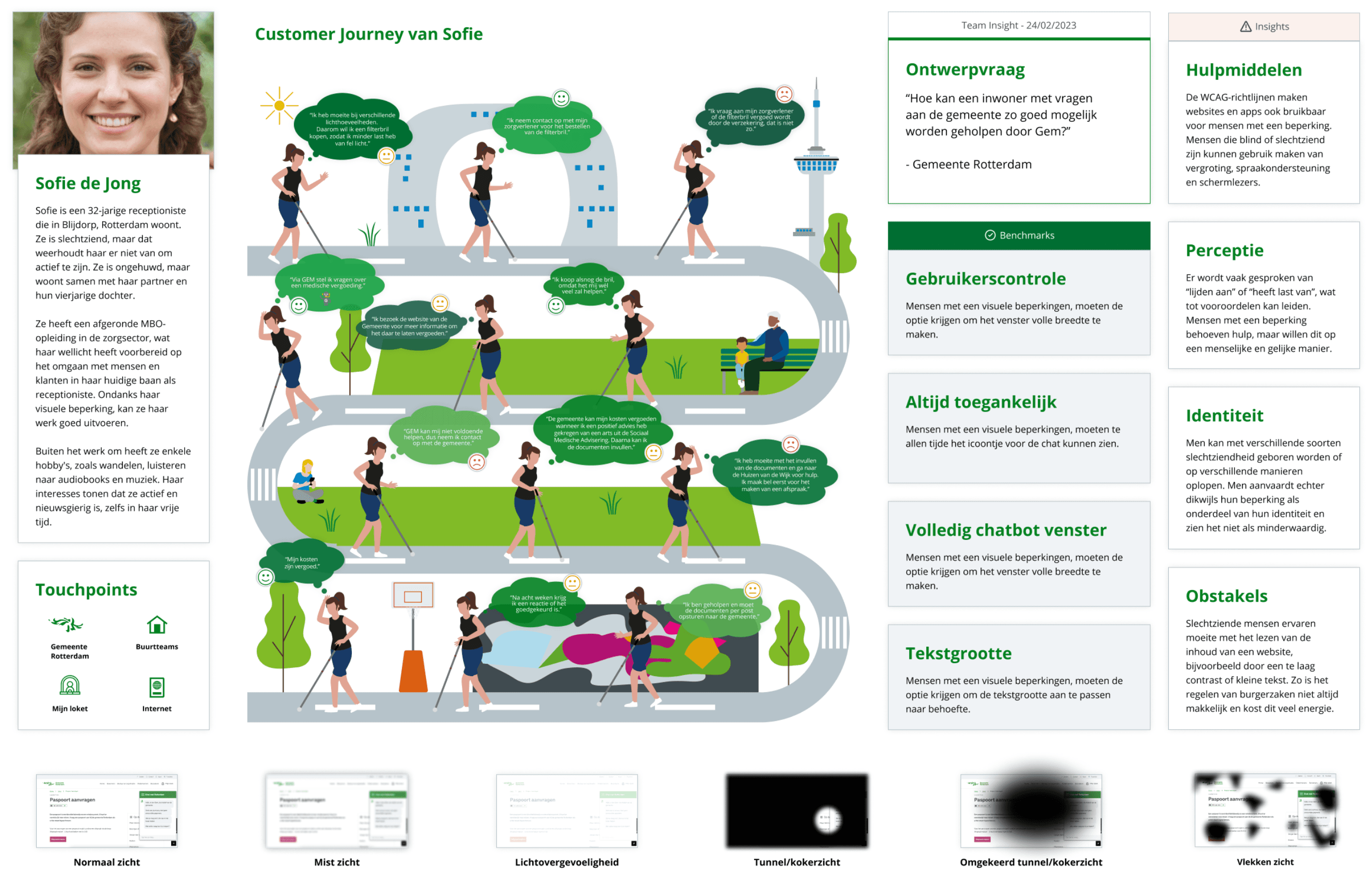


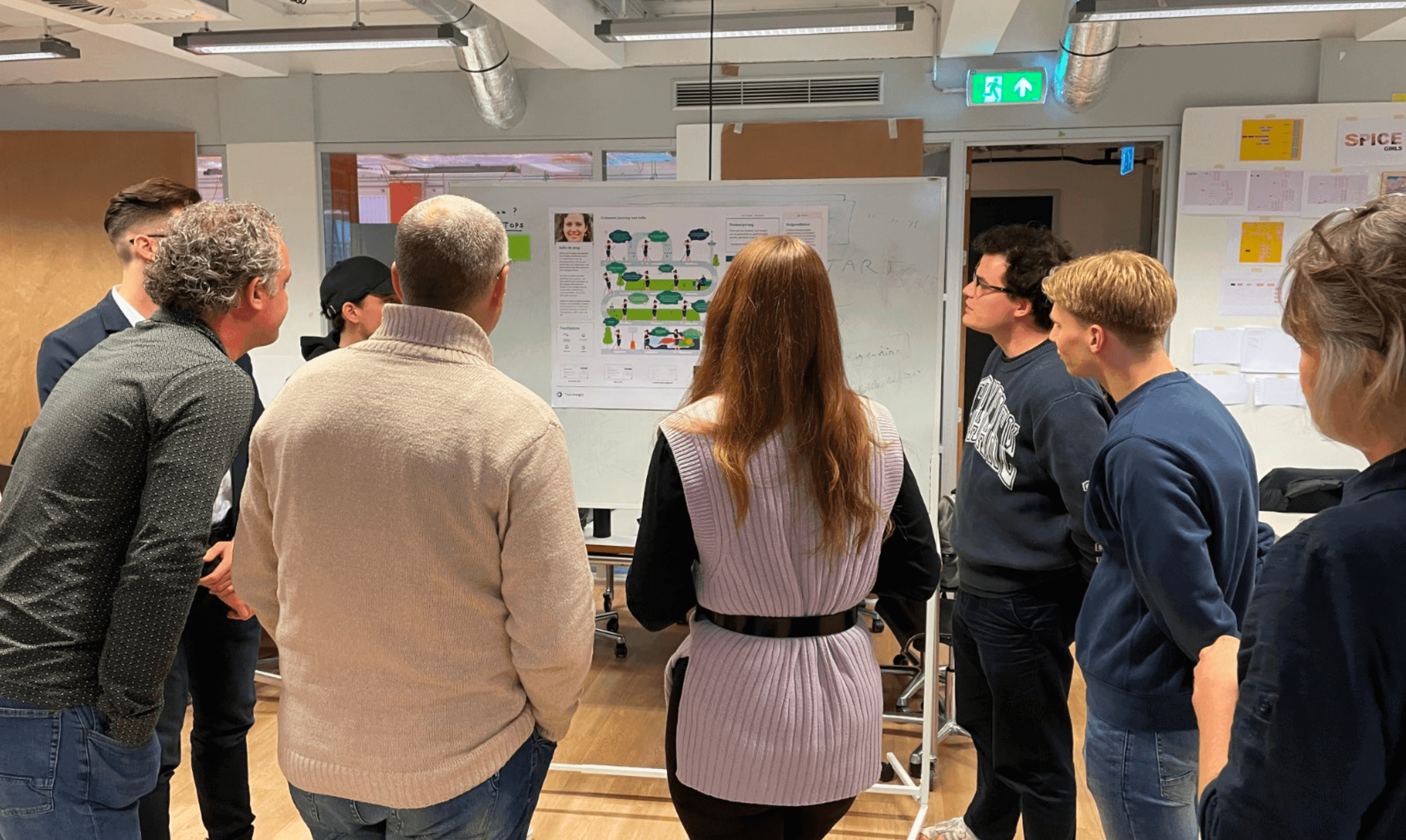


Process and iterations
Our goal for the initial version of the design was to realise a functional prototype that exhibits the core functions of our virtual assistant, GEM. This includes colour contrast, layout, onboarding, text size and auditory feedback.
First Iteration
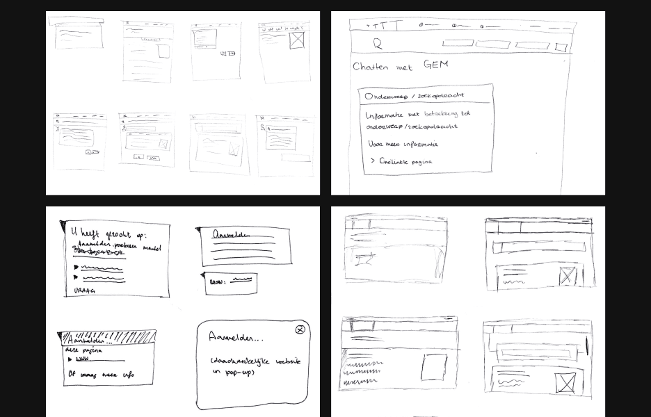
During the initial design iteration, our team focused on creating multiple designs for GEM based on the existing design of the municipal websites. We chose to have the most common accessibility settings appear when the chat with GEM was opened, applying in it the most common colour contrasts that, according to our research, should be comfortable for the target audience.
We had also created a button in the primary menu that could open GEM. The advantage of putting it at the beginning of the menu? After the logo, the button for the chatbot is the first thing that can be read out by the screen reader used by the target audience.
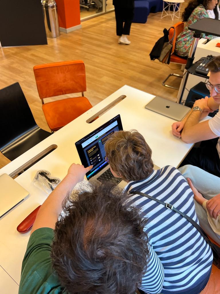
While testing with several respondents from the target group, we soon realised that the button was not found properly. We did not have a screen reader at our disposal during the test, so it was difficult for respondents to find the chat function. So we had to find a new solution for this. Also, the chosen colour contrasts were not comfortable and the obstacles started even before the respondent had opened the chat at all. So we found out that accessibility settings needed to be offered early in the visitor process, so that the visitor can lead a pain-free experience right after entering the website.
Second Iteration
In the second iteration, we took another look at the location and interaction of GEM. We drafted new requirements using MoSCoW method, created a new flowchart of when and how visitors interact with GEM, and revisited our key insights in the form of insight cards.
A key change in this iteration was moving the accessibility settings to the secondary menu. This would make the settings accessible at all times and allow visitors to immediately customize their user experience to their liking after arriving at the website.
We also got GEM up and running by linking it to the, already existing, question bar provided in the middle of municipal websites. In this, the interaction between visitor and GEM also became increasingly important, as GEM would already start to answer a completed question from the visitor. We therefore chose to offer communication using speech as much as possible.
As an equally important point, we also adjusted the colour contrasts that could be offered using the WCAG guidelines.
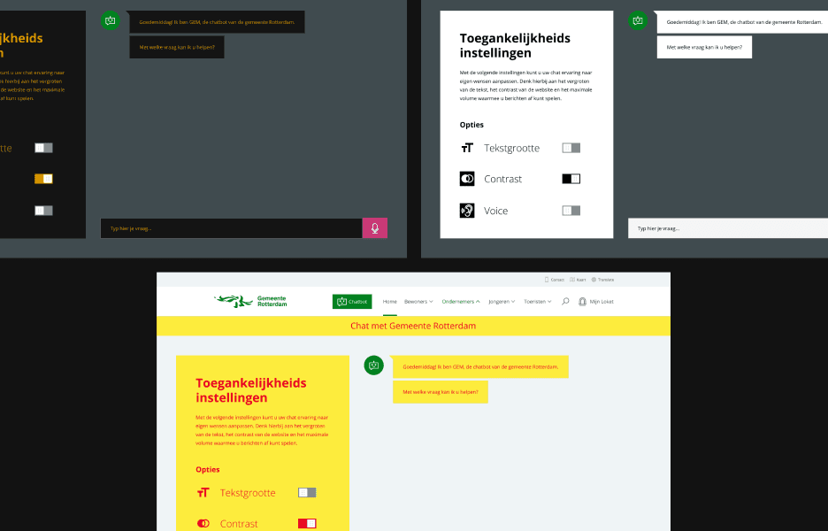








Final design solution
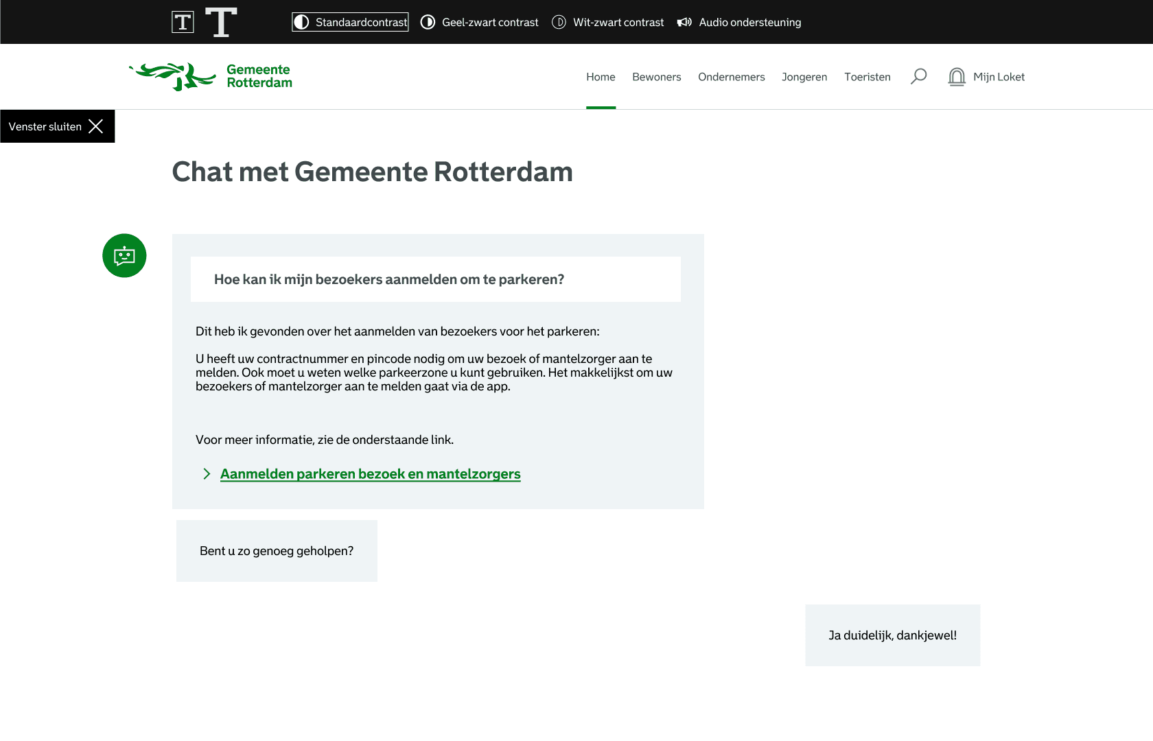
For the final design, we looked at key accessibility settings to make the process as easy, comfortable and effective as possible for the visually impaired audience.
• First comes the first interaction with GEM. A citizen can open the chat window by using the chat icon at the bottom right of the screen, but the chat can also be opened by asking a question in the window at the centre of the screen. Thus, we have taken into account different forms of low vision.
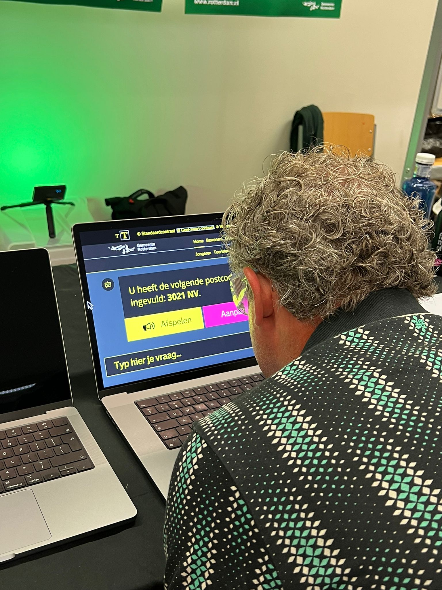
• Second, there are accessibility settings that are available to website visitors at all times. The settings include increasing the text size, adjusting colour contrasts (containing the options ‘standard’, ‘yellow-black’ and ‘white-black’) and turning auditory feedback on/off. Thus, the visitor can always customise his/her own experience to his/her liking.
• In the chat, we have taken into account the playback of the messages shown, give the visitor the chance to play messages again, messages can be recorded by the visitor and input fields can be used according to the technology available to the target group (such as Braille displays).



Personal growth and development
At the beginning of the project, I drew up some learning objectives that I wanted to work on during the project. These learning objectives included improving my research skills in relation to the target group and developing my skills in Figma.
During the project, I was able to take the lead more often during interviews with the target group and tests with respondents. This also made me feel more confident while presenting key insights to the client.
I was also able to work a lot in Figma on branding our team and figuring out how to implement sound to play messages in the chat, among other things. By recording audio files using AI and linking them to the ‘play’ buttons, the respondent using our product got the auditory feedback that was so desired.
Results and key takeaways
During this project, there were several moments when our eyes were opened. We thought we knew what some of the pain points and obstacles of our target audience would be, but the more we interacted with them, many of our assumptions were disproved. We were also able to make new contacts, build a network through the foundations and organisations we were able to talk to, and put down a design that could really solve current problems.
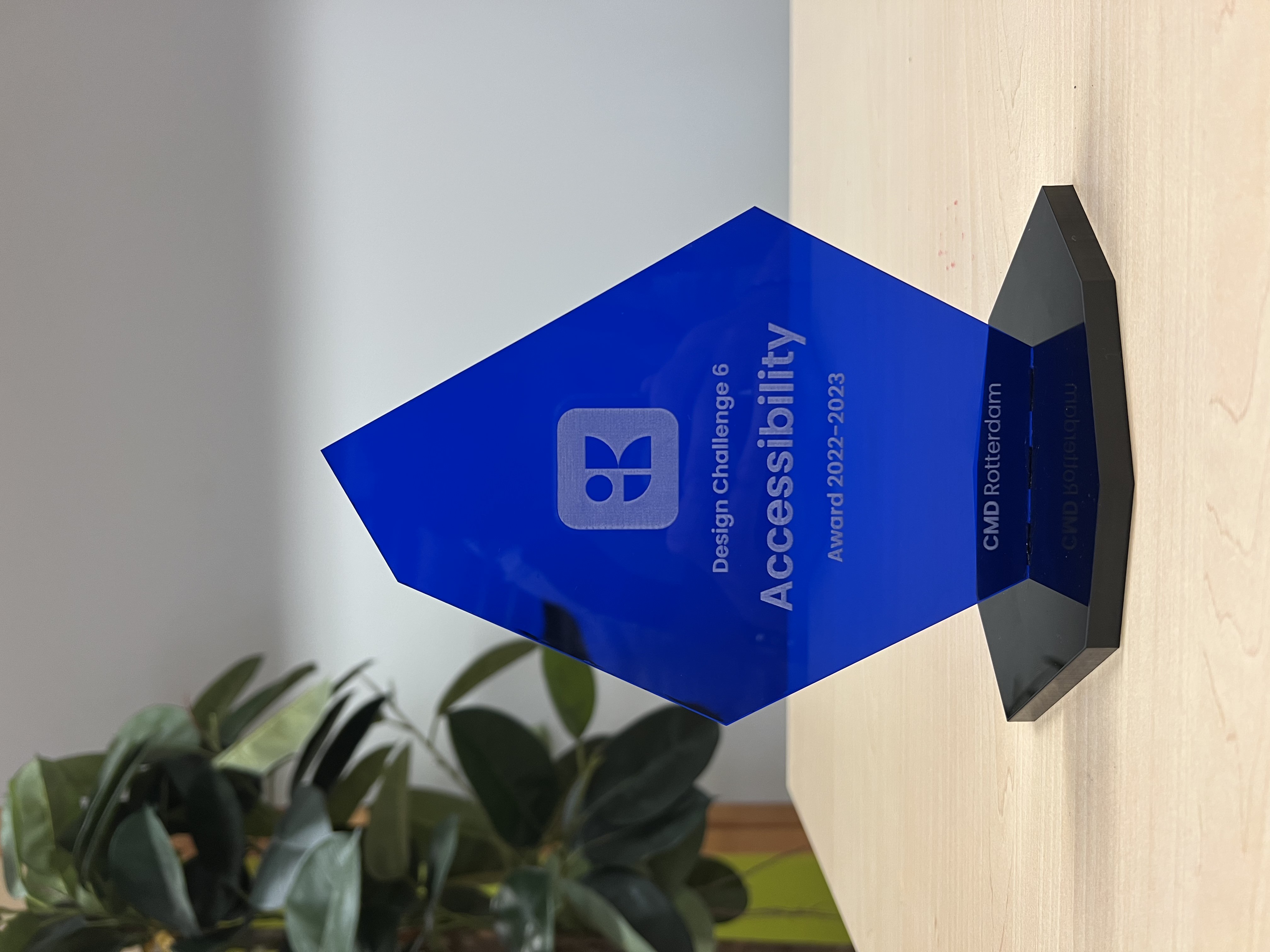
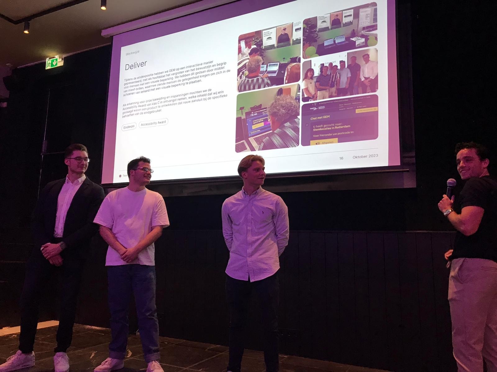
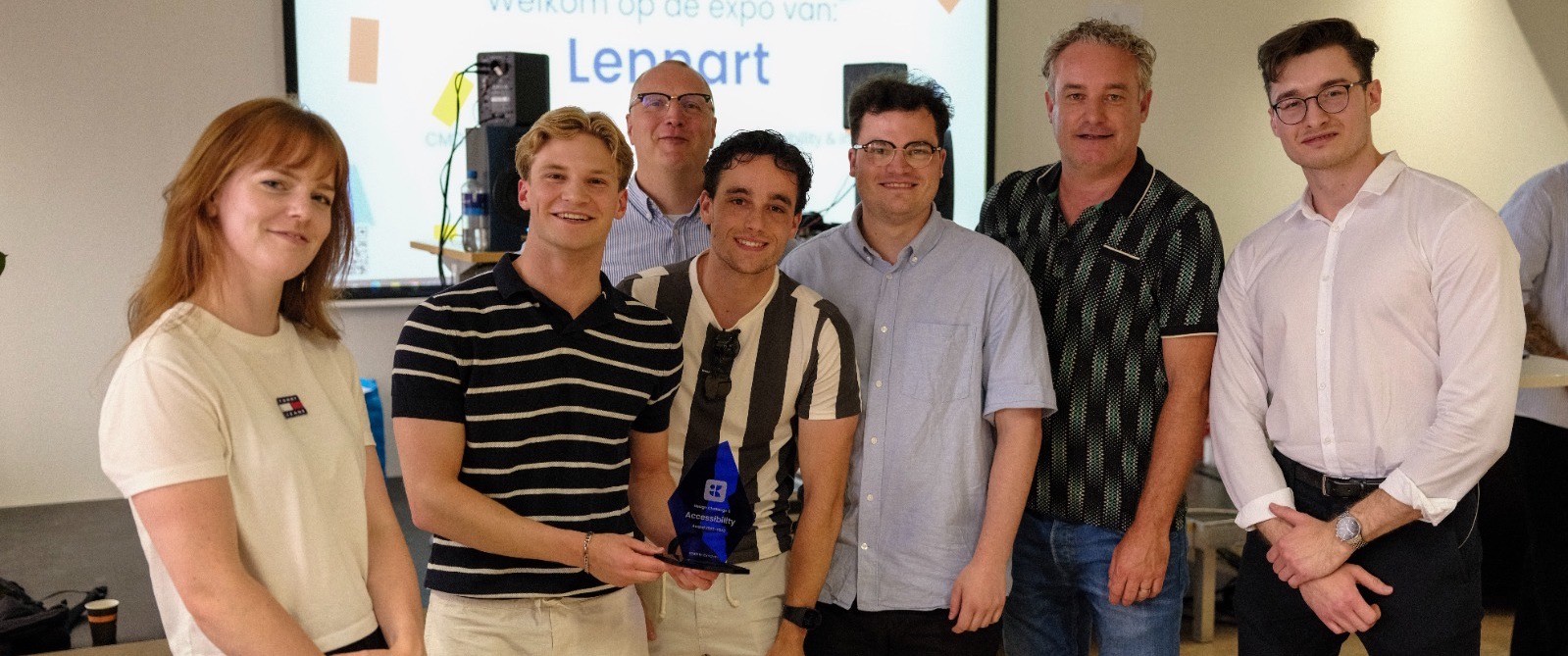
At the end of the project, we had the honour of receiving the Accessibility Award from the client. Not only did they reward our hard work and end result with an award, but we were also invited to give a presentation about our project. At a recurring meeting, on 5 October 2023 in Utrecht, I was allowed to show/present our key insights, choices and designs to 20 other participating municipalities working with GEM day-in and day-out.
